Building a React-Like Component System with Server-Side Rendering in NestJS
Introduction
What This Guide Will Teach You
Is This Guide Right for You?
Why Server-Side Rendering Still Matters
Use Cases Where SSR Excels
The Traditional SSR Problem
Our Solution: Backend Components
Technology Stack
Architecture Overview
Request Flow
Key Design Decisions
Step-by-Step Implementation
Running the Application
Advanced Patterns
Comparison with React
Performance Considerations
Security Best Practices
Troubleshooting
Conclusion
Next Steps
Further Reading
Acknowledgement
Introduction
Modern web development often presents a critical architectural choice: client-side rendering (CSR) or server-side rendering (SSR).
CSR frameworks like React excel at building highly interactive, component-based user interfaces. However, for use cases such as authentication flows, admin dashboards, and security-sensitive applications, server-side rendering offers clear advantages, improved performance, better SEO, and stronger control over data exposure.
The challenge is that moving to SSR often means sacrificing the component-driven development model that makes React so productive. Developers frequently end up writing repetitive templates, manually managing CSS classes, and duplicating UI logic between backend-rendered views and frontend components.
This article introduces a practical solution: a React-like component system built entirely on the server, using NestJS, Handlebars, and Tailwind CSS.
What This Guide Will Teach You
By the end of this guide, you’ll understand how to design and implement a React-like component system for server-side rendering using NestJS.
You’ll learn how to:
- build reusable, composable UI components on the backend,
- manage component variants with Class Variance Authority (CVA) in server-rendered templates,
- integrate Tailwind CSS v4 with NestJS and Fastify,
- build an interactive, server-rendered authentication flow and dashboard,
- and make informed decisions about when to use server-side rendering versus client-side rendering.
Is This Guide Right for You?
This guide is designed for developers who:
- Love the React component model, but need SSR for specific use cases
- Work with NestJS and want to improve their template-based UI development
- Need server-rendered authentication or admin interfaces
- Want to avoid duplicating UI logic between backend and frontend
You should be comfortable with:
- Basic NestJS concepts (modules, controllers, decorators)
- TypeScript fundamentals
- High-level understanding of server-side rendering
- Basic HTML templating concepts
Why Server-Side Rendering Still Matters
Before diving into implementation, let’s understand when and why SSR is the right choice.
Use Cases Where SSR Excels
- Authentication Flows
- Sign-in, sign-up, and password reset pages
- Session management happens server-side
- Reduced attack surface (no client-side auth logic)
- Faster time-to-interactive for critical flows
2. Admin Panels and Dashboards
- Often behind authentication
- Don’t need heavy client-side interactivity
- Benefit from server-side data access
- Simpler deployment (no separate frontend build)
3. SEO-Critical Pages
- Landing pages, marketing content
- Blog posts, documentation
- E-commerce product pages
4. Progressive Enhancement
- Core functionality works without JavaScript
- Enhanced with client-side features when available
- Better accessibility and resilience
The Traditional SSR Problem
The challenge with traditional SSR approaches is maintainability. Consider a typical scenario:
Every button requires manual entry of class names. When your design system changes, you need to find and update every instance. There’s no reusability, and no single source of truth.
Our Solution: Backend Components
With our approach, the same buttons become:
This gives you:
- Single source of truth for component styles
- Variant management using CVA (just like shadcn/ui)
- Easy refactoring when design changes
- Familiar API if you’ve used React
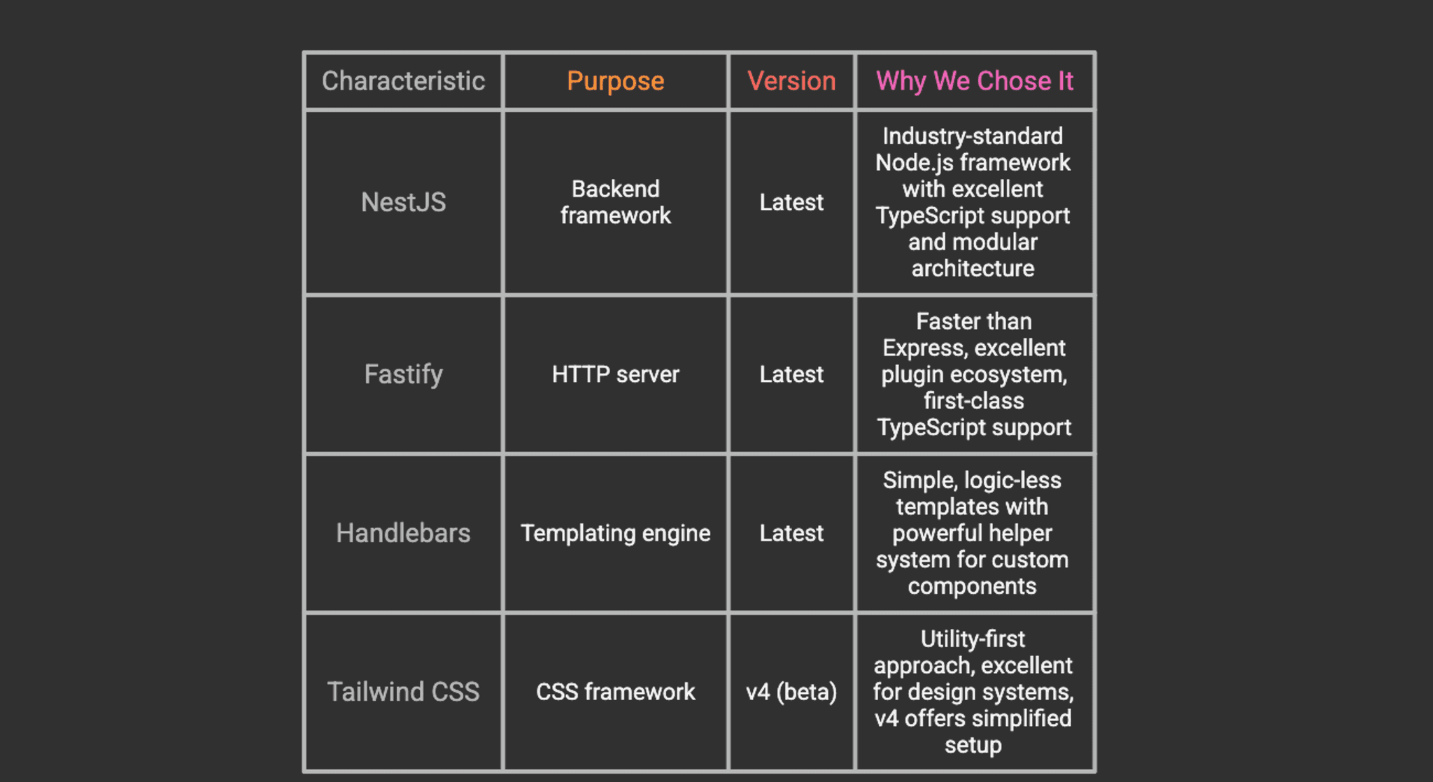
Technology Stack
Our implementation uses a carefully selected stack that balances performance, developer experience, and maintainability.
Core Technologies
Styling Utilities
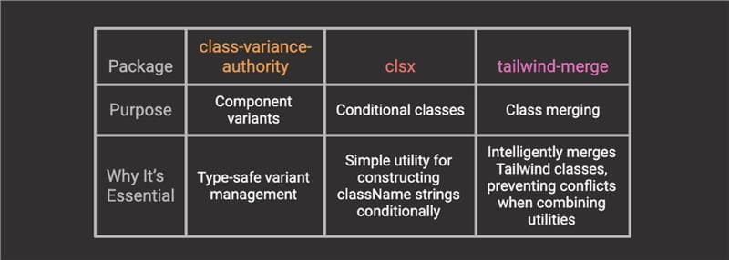
Integration Packages
[!TIP] Why Dev Dependencies?: The styling utilities (class-variance-authority, clsx, tailwind-merge) are installed as dev dependencies because they’re only needed at build time to generate CSS and component classes. They don’t need to ship the runtime bundle.
Architecture Overview
Understanding the high-level architecture will help you see how all the pieces fit together.
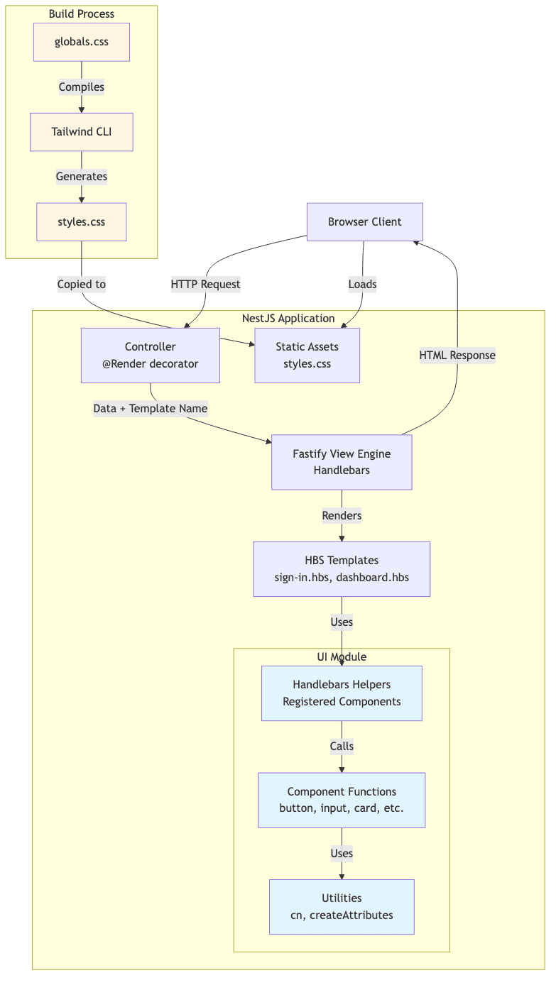
Request Flow
- Client Request: Browser requests a page (e.g., /auth/sign-in)
- Controller: NestJS controller handles the request, prepares data
- View Engine: Fastify’s view engine processes the Handlebars template
- Component Rendering: Template uses registered helpers (components)
- HTML Generation: Components return HTML strings with computed classes
- Response: Complete HTML page sent to client
- Asset Loading: Browser loads compiled CSS from static assets
Key Design Decisions
1. Components as Functions Returning Strings
Unlike React components that return JSX, our components are TypeScript functions that return HTML strings:
This keeps them: - Framework-agnostic - Easy to test - Simple to port to React later
2. Handlebars Helpers as Component Interface
We register components as Handlebars helpers, providing a familiar API:
3. CVA for Variant Management
Using the same pattern as shadcn/ui and other modern component libraries:
Step-by-Step Implementation
Let's build this system from the ground up.
Step 1: Create the NestJS Project
Start by creating a fresh NestJS project using the official CLI:
When prompted, choose your preferred package manager (npm, yarn, or pnpm). For this guide, we’ll use npm.
[!TIP] If you already have a NestJS project, you can skip this step and integrate the following changes into your existing codebase.
Step 2: Install Dependencies
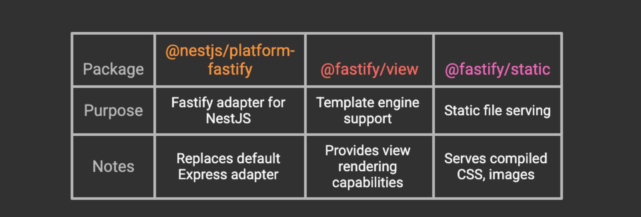
Install the required packages for view rendering and styling:
What each package does:
- @nestjs/platform-fastify – Fastify adapter for NestJS (replaces Express)
- @fastify/view – Template engine integration for Fastify
- @fastify/static – Serves static files (CSS, images, JavaScript)
- handlebars – Minimal, logic-less templating language
- tailwindcss – Core Tailwind CSS framework
- @tailwindcss/cli – Standalone CLI for compiling Tailwind
- class-variance-authority – Type-safe component variant management
- clsx – Utility for constructing className strings conditionally
- tailwind-merge – Intelligently merges Tailwind classes without conflicts
Step 3: Configure Fastify with Handlebars
Replace the default Express adapter with Fastify and configure the view engine.
Update src/main.ts:
[!NOTE] If you don’t have a layout.hbs file hasn't been created yet; you may want to temporarily comment out the layout option to avoid errors. We’ll create it in Step 10.
Configure Asset Copying
NestJS doesn’t copy arbitrary folders into the dist directory by default. Update nest-cli.json to include public, views, and secret-key file (more on this later):
This ensures that: - public/ → dist/public (CSS, images, etc.) - views/ → dist/views (Handlebars templates)
Step 4: Configure Tailwind CSS v4
Tailwind v4 dramatically simplifies the setup process with its new CLI-based approach.
Create the global CSS file
Create public/globals.css:
Usage:
- npm run build:css – One-time build for production
- npm run watch:css – Watch mode for development (auto-recompiles on changes)
[!TIP] Development Workflow: Run npm run watch:css in a separate terminal window while developing. This automatically rebuilds your CSS whenever you change templates or add new Tailwind classes.
Step 5: Create the UI Module Structure
Following NestJS best practices, create a dedicated UI module to encapsulate all component-related code.
Your structure should look like this:
Step 6: Create Utility Functions
Create src/ui/utils/utils.ts:
Why these utilities matter:
- cn() – Safely merges Tailwind classes, resolving conflicts (e.g., px-4 px-6 becomes px-6)
- createAttributesStringified() – Converts props to HTML attributes, handling edge cases like boolean attributes
Step 7: Create the Button Component
Create src/ui/components/button.ts:
Key concepts:
- CVA for variants – Define all button styles in one place with type safety
- Props interface – TypeScript ensures correct usage
- String output – Component returns HTML string (not JSX)
- Composability – Can be extended with custom classes via className prop
[!TIP] You can create additional components following this same pattern: input, card, badge, avatar, kpi, etc. Check the GitHub repository for complete examples.
Step 8: Register Handlebars Helpers
Create src/ui/helpers/handlebars-helpers.ts:
Important concepts:
- Handlebars.SafeString – Prevents HTML escaping (required for rendering HTML)
- Block support (options.fn) – Allows nested content like {{#button}}...{{/button}}
- Conditional helpers – Enable logic in templates without JavaScript
Step 9: Create the UI Module
Create src/ui/ui.module.ts:
Step 10: Create View Templates
Create the layout template at views/layout.hbs:
Step 11: Create Controllers
Create the auth module with the auth controller src/auth/controllers/auth.controller.ts:
Running the Application
Now let's see it in action!
1. Build the CSS:
npm run build:css
2. Start the development server:
npm run start:dev
3. (Optional) Watch CSS in a separate terminal:
npm run watch:css
4. Visit the sign-in page:
Open your browser to http://localhost:3000/auth/sign-in
You should see a beautifully styled sign-in page with: - Two demo credential buttons - Email and password inputs - A submit button - All styled with Tailwind CSS - All using your reusable components
Advanced Patterns
Nested Components
Nested Components
One of the most powerful features is component composition. You can nest components just like in React:
Conditional Rendering
Use the registered conditional helpers for dynamic content:
Custom Helpers for Complex Logic
For more complex scenarios, create custom helpers:
Usage in templates:
Comparison with React
Let's compare our backend component approach with React to understand the similarities and differences.
Similarities
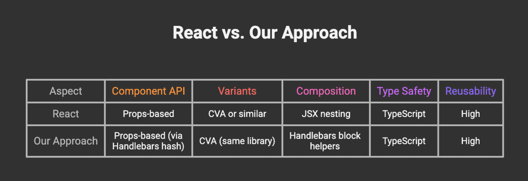
Differences
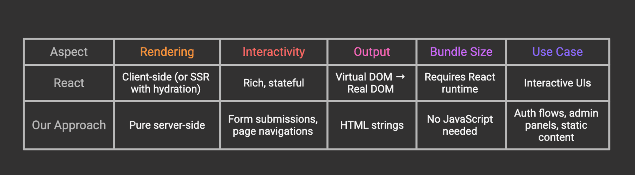
When to Use Each
Use React (or similar) when: - Building highly interactive UIs (dashboards, editors, etc.) - Need client-side state management - Require real-time updates - Building single-page applications (SPAs)
Use our SSR approach when: - Building authentication flows - Creating admin panels with simple interactions - Need fast initial page loads - SEO is critical - Want to minimize JavaScript bundle size - Progressive enhancement is a priority
Migration Path
One of the benefits of this approach is that it’s easy to migrate to React later:
Shared Design System: Your CVA variants can be copied directly to React components
Same API: Props structure is nearly identical
Gradual Migration: Start with SSR, add React for interactive parts
Hybrid Approach: Use SSR for auth, React for dashboard
Example migration:
The variant definitions and utility functions remain identical!
Performance Considerations
Server-Side Rendering Benefits
- Faster First Contentful Paint (FCP)
- HTML is rendered on the server
- No JavaScript parsing required for initial render
- Especially beneficial on slower devices
2. Reduced Bundle Size
- No React runtime
- No hydration code
- Only CSS and minimal JavaScript for interactions
3. Better SEO
- Content is immediately available to crawlers
- No JavaScript execution required
- Faster indexing
4. Highly cacheable by browsers and CDNs
- Static HTML responses can be cached effectively
- CDNs can serve cached content closer to users
- Reduces server load and improves response times
- Works well with HTTP caching headers (Cache-Control, ETag)
[!WARNING] Cache Headers: Incorrectly configured cache headers can be dangerous. Avoid caching sensitive pages (e.g., user-specific content) or use appropriate cache-control directives. Public caching of private data can create security vulnerabilities, allowing one user’s data to be served to another.
Optimization Tips
1. CSS Optimization
2. Caching
Enable caching for static assets:
3. Template Caching
Handlebars automatically caches compiled templates in production. Ensure you’re running in production mode:
4. Compression
Add compression for responses:
Security Best Practices
When building authentication flows with SSR, security is paramount.
1. CSRF Protection
Install CSRF protection:
npm install @fastify/csrf-protection
Configure it:
Use in forms:
2. Session Management
Use secure session handling:
npm install @fastify/secure-session
Create a secret-key file using:
3. Input Validation
Use class-validator for DTO validation:
npm install class-validator class-transformer
4. Rate Limiting
Protect against brute force attacks:
npm install @fastify/rate-limit
5. Helmet for Security Headers
npm install @fastify/helmet
Troubleshooting
Common Issues and Solutions
1. Tailwind Styles Not Loading
Symptoms: Page renders but has no styling
2. Handlebars Helpers Not Working
Symptoms: {{button}} renders as text or throws error
3. Components Rendering as Escaped HTML
Symptoms: You see <button class="..."> as text in the browser
4. Layout Not Found Error
Symptoms: Error: ENOENT: no such file or directory, open '.../views/layout.hbs'
5. Fastify Plugin Registration Errors
Symptoms: Errors about plugin registration order
6. TypeScript Compilation Errors
Symptoms: Build fails with type errors
Conclusion
By completing this guide, you have successfully architected a robust server-side rendering system that bridges the gap between traditional backend templating and modern component-based design. You have moved beyond simple HTML generation to create a structured, type-safe environment where UI components are first-class citizens.
Instead of relying on heavy client-side frameworks for every interaction, you have implemented a lightweight, performance-first solution that delivers content to users instantly. You have established a scalable pattern using NestJS and Handlebars that mimics the best parts of the React ecosystem composability, prop interfaces, and variant management without the associated runtime cost. This architecture provides a solid foundation for building content-heavy applications where SEO, initial load performance, and maintainability are paramount.
Next Steps
1. Expand Your Component Library - Create more primitives: card, badge, avatar, table - Build composite components: navbar, sidebar, modal - Add form components: select, checkbox, radio
2. Add Real Authentication - Integrate Passport.js or similar - Implement JWT or session-based auth - Add OAuth providers (Google, GitHub, etc.)
3. Build a Dashboard - Create data visualization components - Add role-based access control
Further Reading
Official Documentation: - NestJS Documentation – Comprehensive guide to NestJS - Fastify Documentation – High-performance web framework - Handlebars Guide – Templating language reference - Tailwind CSS – Utility-first CSS framework - CVA Documentation – Class Variance Authority
Example Repository: - ReactSSR GitHub Repository – Complete source code with examples
Acknowledgement
This approach was inspired by: - shadcn/ui – For the CVA pattern and component API design - React – For the component model and composition patterns - NestJS community – For excellent documentation and examples - Tailwind CSS – For making utility-first CSS practical
Thank you for reading! If you found this helpful, consider: - Starring the GitHub repository - Sharing your experience and improvements - Reporting issues or suggesting enhancements
Happy coding!